Google Calendar has been upgraded to a mobile version for a while. Now it's time for the web version with material design and also added new features to help you manage your time more efficiently and get more done. In the new Calendar for web, you can:
-
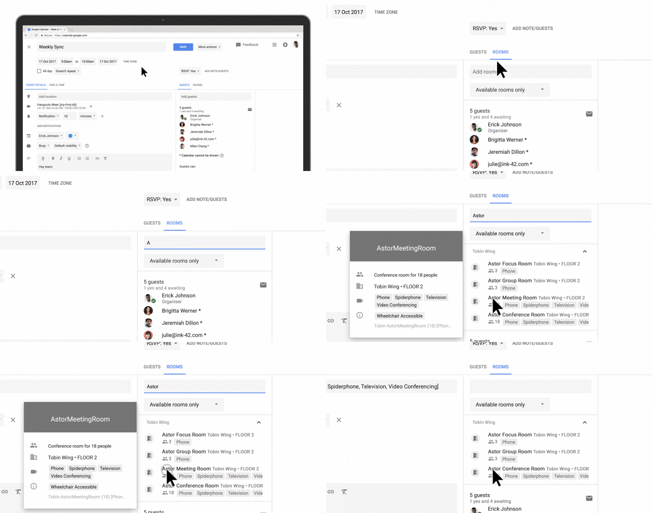
See conference room details when booking a room.
G Suite admins can now enter detailed information about their organization’s meeting rooms—so employees know where a conference room is located, how large it is, and whether it has audio/video equipment or is wheelchair accessible. Employees can simply hover over the room name in Calendar when they want to book a space, and a hovercard will pop up with details about the conference location and resources.
-
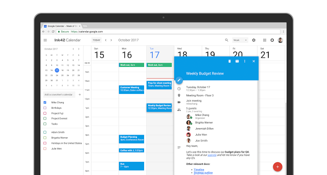
Add rich formatting and hyperlinks to your Calendar invites
Link to relevant spreadsheets, documents or presentations in your Calendar invite and open them directly from the new “Event Detail” view. This can help you create more detailed agendas and ensure all materials are in one place before your meeting starts.
-
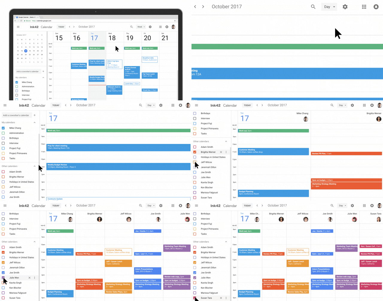
Manage multiple calendars side by side in “Day” view
Now you can view and manage calendars in separate columns. This makes it easier for employees who manage multiple calendars, like administrative assistants, to schedule meetings on behalf of their teams. Click “Day” view and select the calendars you want to compare.
There are a number of other changes in Calendar, too. Now you can see the contact information of meeting participants when you hover over their names in a Calendar invite. There’s also a new way to view and restore deleted items in one place in case you accidentally delete a meeting invite. Additionally, "Day,” "Week,” and "Month" views are now more accessible, featuring better compatibility with screen readers. For more detail on changes, check out this post.
Additional information for G Suite admins
To help you and your users transition to the new Calendar web UI, there are two rollout options to choose from (see the Help Center for more information):
- Automatic—Automatic is the default option. Starting Nov. 14, 2017, for Rapid Release domains and Nov. 28, 2017, for Scheduled Release domains, Calendar will gradually transition your users to the new UI. The transition will take about 8 weeks (including opt-in and opt-out stages). No action is required on your part for the Automatic option.
- Manual—Alternatively, you can choose to manually control when to move your users to the new UI in the Google Admin console. For example, though we've worked with the developers of the most popular Calendar Chrome extensions to prepare for the new UI, you might have users who depend on an extension that hasn’t been updated yet. Or you might like to check out the new UI in your test domain or organizational unit (OU).
To choose the Manual option, go to Apps > G Suite > Calendar > New Calendar. Here, you can set by organizational unit when you’d like your users to access the new version of the Calendar UI. If you choose the Manual rollout option, please plan to transition all your users to the new UI before Feb. 28, 2018. Any users who are still accessing the old Calendar UI on Feb. 28, 2018, will be transitioned to the new UI, with no ability to opt out.
We recommend sharing this guide, as well as the resources below, with your users to help them understand the new layout changes.
For more information on how to add structured data to your rooms and resources, check out the Help Center.
Note that this feature will work with both the classic Calendar UI and the new Calendar UI.
Contact Us: www.gopomelo.com
Email: info@gopomelo.com


 Twitter
 Youtube
